
Design a Logo, part 2
This is a tall order since I am trying to teach something that will be different for everyone. But I can give you "rules" and a template to follow in order to create your own logo.
What follows below are guidelines in designing a logo for a Writer. If you have other interests, some of these steps will help you, but I am slanting this primarily for the novelist.
Think about color. What do you envision when you think of cozy mysteries or YA? Mysteries may lean toward black or shadowy colors while YA will be lighter and more vibrant. The color should speak to your audience and not to your particular likes.
Design elements should be simple, yet dynamic. I know. It sounds like I'm contradicting myself, but I'm not. Take for example the ever-present illustration of a plumed writing instrument as the logo for a writer. For the love of all that's holy, don't do it! LOL
I don't know how many of those I've seen on letterhead and business cards. It's clip art and it's everywhere. It also screams amateur. Want to liven that up?
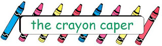
 Repetition is another design element you can utilize. Do you have a YA novel set in an art contest? Pull out one aspect of the setting, (ex: crayon) and duplicate it across your header. It makes a neat border and reinforces your world building.
Remember when I asked you to make the logo dynamic? The way to make a static picture look energized can be achieved with several easy tricks.
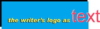
• the western world reads left to right. Which direction does your current graphic move? If it's a picture of an object looking straight at you, that might be static. Find one where it's moving from left to right.
• does you logo consist of nothing but text? Give it some life (and depth) by using drop shadows underneath the text.
What follows below are guidelines in designing a logo for a Writer. If you have other interests, some of these steps will help you, but I am slanting this primarily for the novelist.
Think about color. What do you envision when you think of cozy mysteries or YA? Mysteries may lean toward black or shadowy colors while YA will be lighter and more vibrant. The color should speak to your audience and not to your particular likes.
Design elements should be simple, yet dynamic. I know. It sounds like I'm contradicting myself, but I'm not. Take for example the ever-present illustration of a plumed writing instrument as the logo for a writer. For the love of all that's holy, don't do it! LOL
I don't know how many of those I've seen on letterhead and business cards. It's clip art and it's everywhere. It also screams amateur. Want to liven that up?
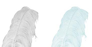
Take that plume art and blow it up until it takes up a good hunk of your page. Now change the color to a 20% of whatever color is closest your color palette of choice. Use it as the background for your page. It's delicate, unobtrusive and it gives you color and design without hitting you over the head. It's actually a very nice effect for Romance writers.
Repetition is another design element you can utilize. Do you have a YA novel set in an art contest? Pull out one aspect of the setting, (ex: crayon) and duplicate it across your header. It makes a neat border and reinforces your world building.Remember when I asked you to make the logo dynamic? The way to make a static picture look energized can be achieved with several easy tricks.
• the western world reads left to right. Which direction does your current graphic move? If it's a picture of an object looking straight at you, that might be static. Find one where it's moving from left to right.
--but here's an added caveat. If the art is placed on the right hand side of your page you want that movement going to the left. This way, the eye stays on the page. You want to move the reader to the next important aspect of your page.
• put your text or art in a box. Now make it punch through so part of it is now outside the box. Instant movement.
• put your text or art in a box. Now make it punch through so part of it is now outside the box. Instant movement.
• does you logo consist of nothing but text? Give it some life (and depth) by using drop shadows underneath the text.
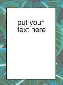
Finally, you can also use any generic photo as a canvas where only a small part of it can be seen. Have a favorite woodland scene in your photo album? Try this effect.
I hope I've given you some ideas on how to create your own design elements with very little effort. There are a lot of things to try. I hope these few tricks will springboard you to new ideas. Feel free to email me if you have any specific questions.
Comments